Branding Trinidad’s Legacy Agricultural Communities

In the heart of Trinidad’s pristine rural communities, farmers have cultivated some of the world’s most sought-after cocoa for decades. Branding the Alliance of Rural Communities and Destination Chocolate products helped these local micro-economies to bring treasured products successfully and equitably to market. My role on this project was strategy development as part of the Abovegroup team.
PROBLEM OUTLINE

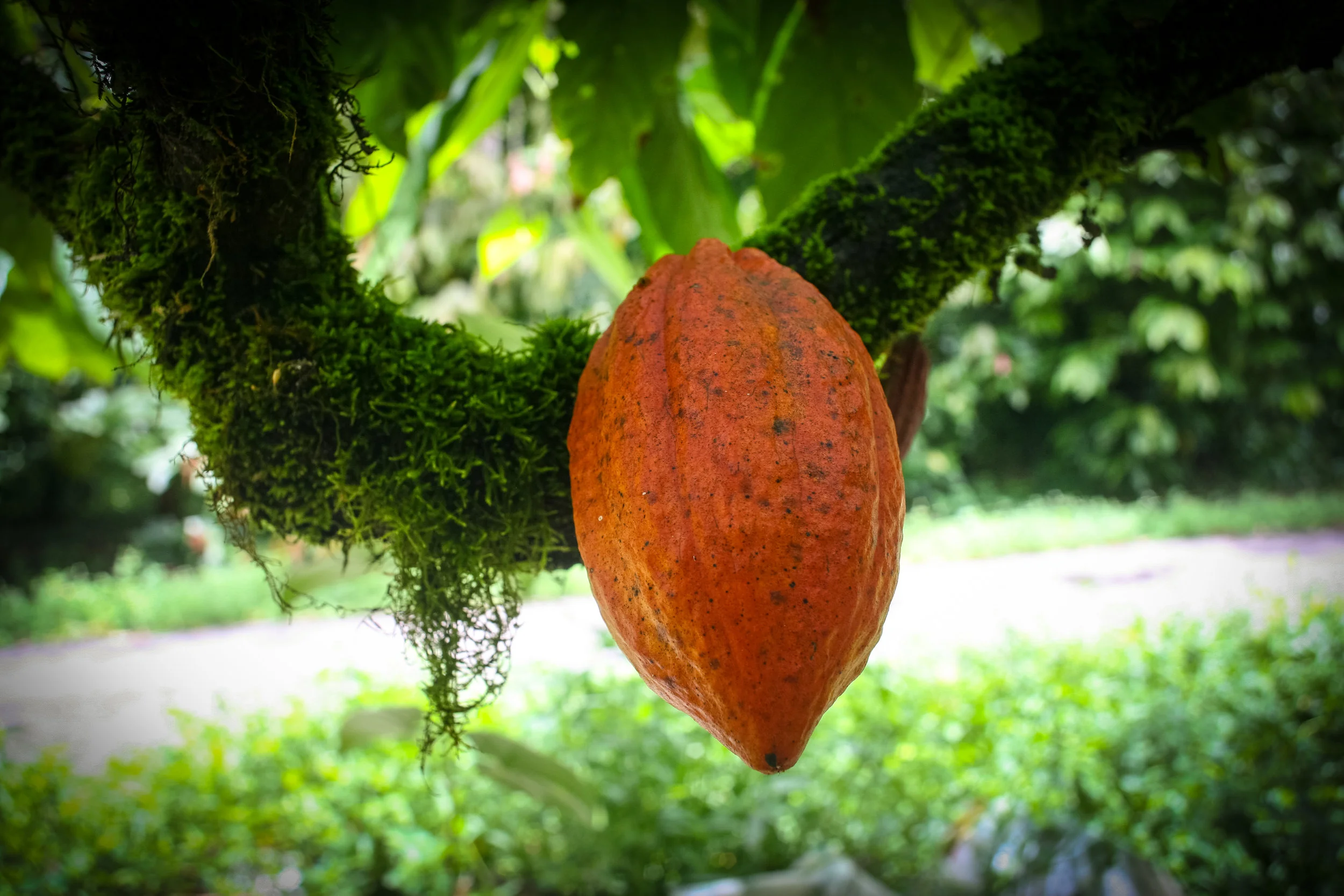
The community chocolate project is an offshoot of Sun Eaters Organics and Destination Chocolate, with the goal of successfully bringing chocolate products from rural communities in Trinidad & Tobago to market. The project aims to develop sustainable, rural, locally-owned cocoa and chocolate producing businesses by collaborating with government and community stakeholders, mainly through the Alliance for Rural Communities of Trinidad and Tobago (ARCTT) and Destination Chocolate. We worked closely with the founder of ARCTT to first brand the community chocolate products from Biche and Cushe, then Brasso Seco, as well as the ARCTT brand.
STRATEGIC INPUT
The chocolate brand’s key proposition of celebrating the richness of new beginnings is an homage to the quiet, revolutionary act of closing the gap between the farmers and the production of the chocolate. It is a catalyst for sustainable growth, innovation, financial stability, togetherness, and a foundation for long term regenerative value. The new familiarity with cocoa growing and reinvigoration of the industry for future generations brings community history and identity full circle.
Even so, there were constraints, both for our client and for Abovegroup, in developing this brand. Our approach to this project was to remain as inclusive as possible, and to design with these constraints. Design fosters relationships by being part of the community and encouraging an approach that considers all stakeholders.
DESIGN OUTCOME
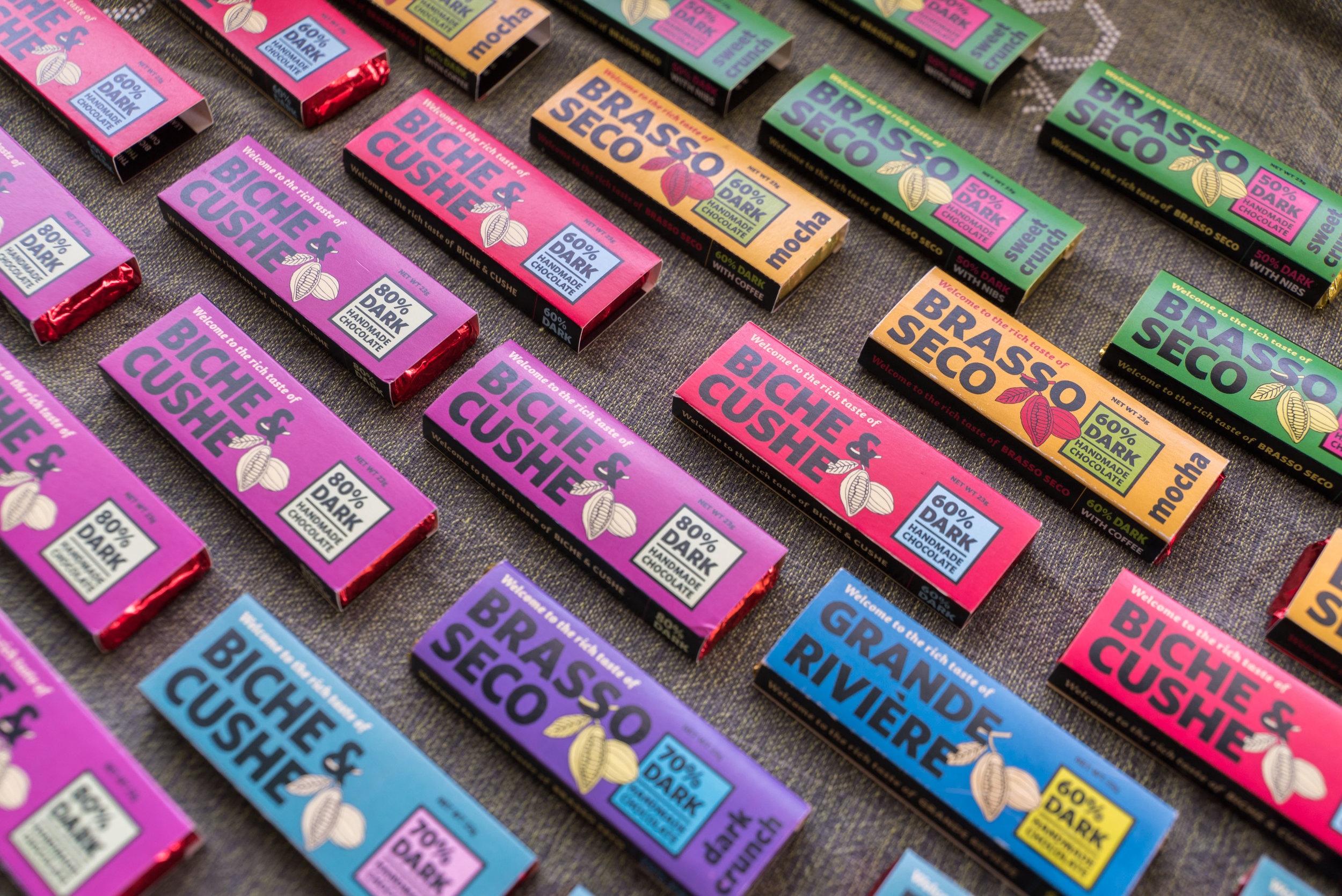
Though this project started with design with the label for chocolate from Biche & Cushe, we knew it had to be scalable for as many communities as were willing to undertake their own chocolate production ventures with the guidance of the ARCTT.
The two immediate considerations were the small package size and brand scalability. In a market where the average bar size was 6 inches wide and 2 inches high, we had to make sure this bar, at 4 inches wide and 1.5 inches high, could be competitive on shelves with larger bars that had more opportunity for illustrative label designs and intricate, textured patterning.
Building a separate brand for each community would have been unwieldy, expensive and out-of-line with the goals of this project. The evolution of the brand meant that each community’s brand should speak the same visual language, despite the need for individuality and distinction. It was less about competition and contrast; each community had something to offer, and this solution showcased that distinction. Eventually as sales came in the door, the team developed a dual-function multi pack that doubles as a gift box eight bars, as well as a point of purchase sales package for retail supermarkets.

